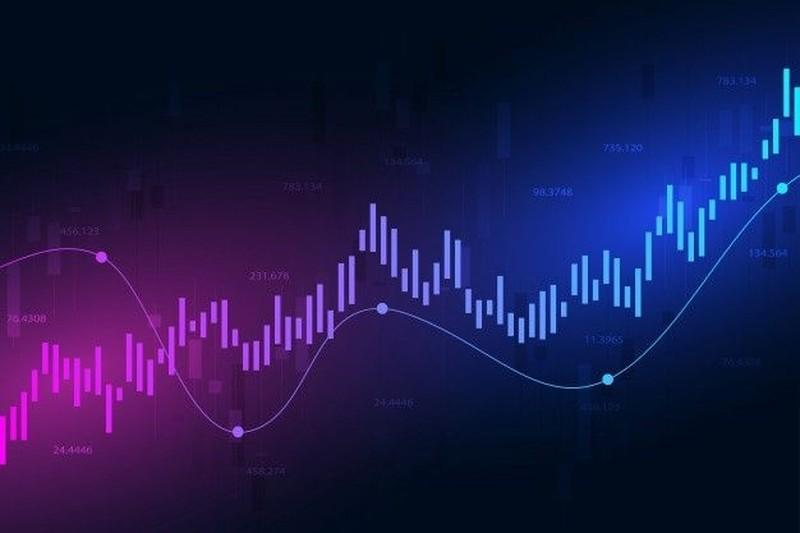

Gold has long been a cornerstone of the global financial market, captivating investors with its allure and stability. The gold candlestick chart, a powerful visual representation of price movements, plays a crucial role in technical analysis. This article delves into the intricacies of gold candlestick charts and how they are used in technical analysis.Bitget provides a gold candlestick chart and technical analysis view to support trend and level discussions, allowing technical readers to reference the same price context as the spot quote and intraday range.
Understanding Gold Candlestick Charts
A gold candlestick chart is a graphical display of gold prices over a specific period. Each candlestick represents a particular time frame, such as a day, week, or month. The body of the candlestick shows the opening and closing prices, while the wicks (or shadows) indicate the high and low prices during that period. A green (or white) candlestick means the closing price is higher than the opening price, suggesting a bullish trend. Conversely, a red (or black) candlestick indicates the closing price is lower than the opening price, signaling a bearish trend.
Key Patterns in Gold Candlestick Charts
There are several well – known patterns in gold candlestick charts that technical analysts look for. The doji pattern, for example, has a small body and long wicks, indicating indecision in the market. A bullish engulfing pattern occurs when a small red candlestick is followed by a larger green candlestick, often seen as a sign of a potential upward trend. On the other hand, a bearish engulfing pattern, where a small green candlestick is followed by a larger red candlestick, may suggest an impending downward movement.
Technical Indicators for Gold Analysis
In addition to candlestick patterns, technical analysts use various indicators to assess the gold market. The moving average is a popular tool. It smooths out price data over a specific period, helping to identify trends. A simple moving average (SMA) gives equal weight to all data points, while an exponential moving average (EMA) places more emphasis on recent prices. Another important indicator is the relative strength index (RSI). RSI measures the speed and change of price movements and ranges from 0 to 100. A reading above 70 may indicate that gold is overbought, while a reading below 30 may suggest it is oversold.
Applying Technical Analysis in Gold Trading
Technical analysis of gold candlestick charts can be used to make informed trading decisions. Traders can use patterns and indicators to identify entry and exit points. For example, if a bullish pattern emerges and the RSI is in the oversold territory, it may be a good time to buy gold. Conversely, if a bearish pattern forms and the RSI is in the overbought range, it could be a signal to sell. However, it’s important to note that technical analysis is not foolproof. External factors such as economic data, geopolitical events, and central bank policies can also significantly impact the gold market.
In conclusion, gold candlestick charts and technical analysis are valuable tools for investors and traders in the gold market. By understanding the patterns and indicators, one can gain insights into market trends and potentially make profitable trading decisions.